Logo

Working with this logo has been described as "hell" by peers, however I have no objections to the use of the logo, it is a script based visual, however I think it works for the target audience.
Tag line ideas
A refreshing escape for you hair
Escape the rush, instant refresh
Escape the rush, instant indulgence
Escape the rush, refresh your mind
Refresh your hair, refresh your mind
Boards
The brief states that we can only submit "up to 8 images" of work. This is proving tricky in creating the final boards as they will.
I have broken the boards up into individual elements including:
Board 1: x4 images comprising of each scent across 50ml, 200ml, 400ml.
Board 2: x3 images of the Point of sale material
Board 3: x4 images of technology images including smart phone, tablet and Imac
Board 4: x4 images of possibilities for packaging.
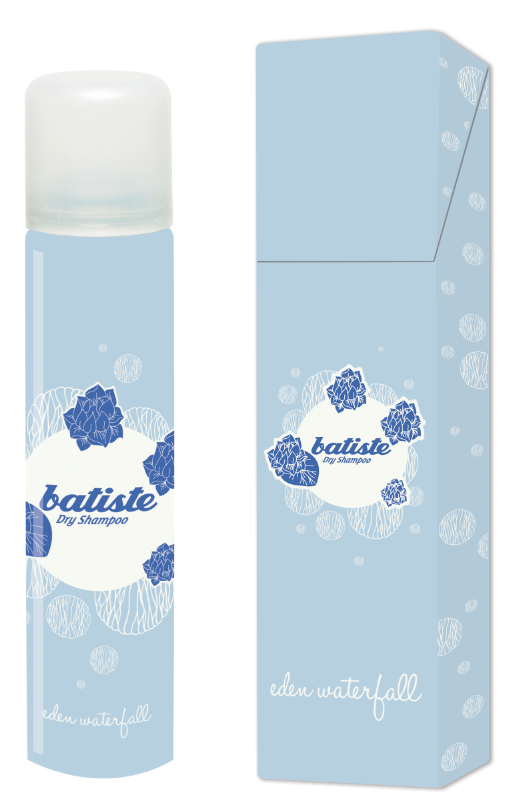
Board 1

Each grey area shows where the 3 cans (50ml, 200ml, 400ml) sit in their respective collection of scents
The area above the images has 20mm for a name title for each scent.
Board 2

the "The Escapism Range" is there for placement reference only at this point, but it has been placed directly under the Batiste logo to allow the judges to associate the name instantly with the existing logo.
Board 3

Using the grid from the logo and diving the board into 4 separate sections has allowed me to make each additional board with a consistent layout, the type can be kept to a minimum.
I have lead the eye from Batiste logo through to images, through to the supporting copy last.
Board 4

This is 15 images, 7 more than allowed. I am fearful however that these guidelines will be overlooked by other entrants and the judges will be lenient, meaning we will cut out imagery for no reason, jeopardising our chances.


the designs have automatically clipping masked into hundreds of small squares, causing issues when trying to find out the hexadecimal codes of the pantones.


Sketched, live trace, photoshop water colouring.


Using the warp tool has allowed me to add photorealistic imagery to the sketch.


It is difficult to decided what the impact board should be, I feel this shows quality across the range.

Adding the nets which were supplied proved to be very difficult, not all of them fit on, I chose 3 designs with space for pantone swatches of all 4 cans.

Adding little pieces of body copy allows for some clarification, without over crowding.
DONE!

No comments:
Post a Comment